Why Go Mobile?
Why Go Mobile?
There isn’t a single business owner out there that says they wouldn’t love to rank number one in a Google search or even be happy with listing on the first page of Google. In 2015, Google made the announcement that mobile friendly websites would now be a key factor in search engine ranking. If your website was not mobile optimized you would consequently be bumped off the first page and pushed further and further back once the Google scan tool would analyze your website if you were not mobile optimized.
Business owners are now just starting to realize how essential a mobile friendly website really is. Many of them started to slowly notice they were loosing their Google rankings more and more. There are quite a few business owners out there that were very happy with keeping their old website up and not making the conversion until they lost the placement.
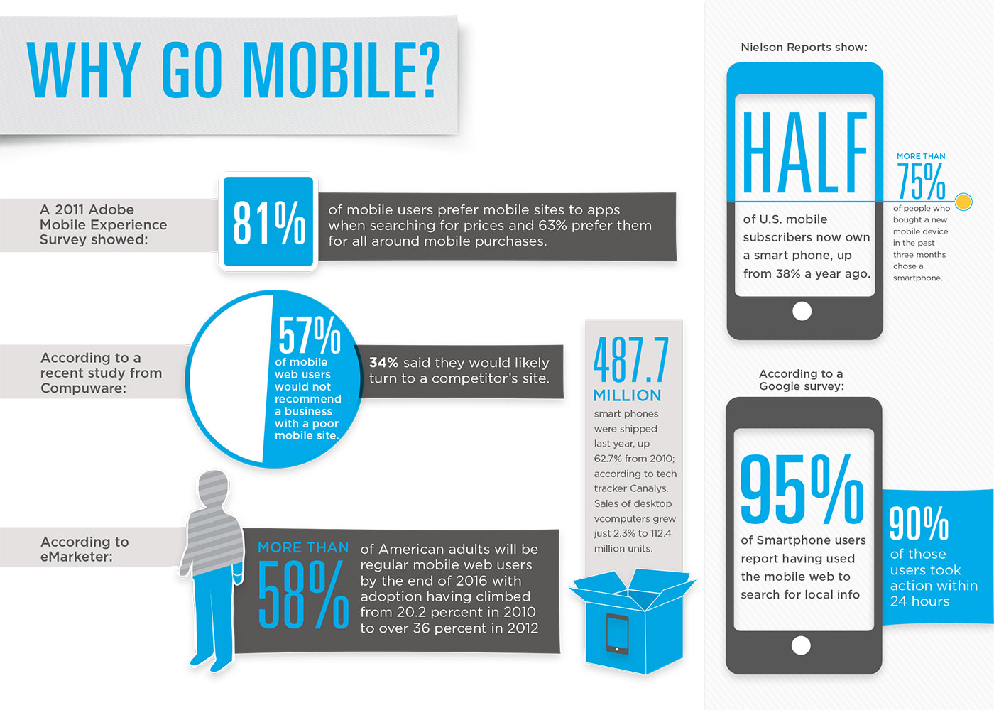
Now it is more pressing than ever to have your website mobile friendly. With more than 90 percent of users searching the web from a mobile device and that number grows by the day, it is truly ideal to have a mobile friendly web design for your consumers. It is also essential that when you you do finally decide to make the conversion that you consider the user experience. Not just any responsive website will do if you are counting on bringing your consumers to the website and keeping them there by giving them a great experience using it on their mobile device.
The basic functions your website will need when being mobile optimized is that you consumers will not need to zoom in or zoom out when visiting the website. Also having easy to navigate menus making it easy for the user to get around the website. Keeping forms simple and non-intrusive when trying to capture a consumers name, phone number and email address is very important. Do not ask them for too much information just get the basics and you will have a better chance in capturing those online leads.
Including eye catching call to actions is an important part to any website, placing this a prominent place with a color that stands out for the user is a great way to get the consumer to respond to the call to action. Another thing that is very important is considering the load time of the website. If you website is taking a great deal of time to load you may loose that user very quickly because of the simple reason it is just taking too long to load. The last thing to really consider is making it easy for your consumer to contact you. Whether that is in a contact form, email, phone number “click to call” or just being able to view and or click on your address and get redirected back to google maps.
Being able to use these simple functions like moving around the website with minimal effort, and the ability to read everything clearly are all key when considering how to create and design your mobile website. One thing to always keep in mind is a truly responsive design will look just as good on the users mobile device and or tablet as it does on a desktop. So if you haven’t done so already its time to have your website mobile friendly.
Give us a call today at (904) 574-9775
so we can help your business get back on track.